Comic Review: Itty Bitty Hellboy #1

By Comix

Hellboy has been through a hell of a lot of things. From monsters and ghosts to love and death, the red beast has taken on the best and the worst the world has thrown at him. With this month marking the 20th anniversary of his creation, a new take on Hellboy will be hitting shelves in a couple of weeks that will shove him up onto a whole new level of sick and twisted depravity. Something so evil, so wicked, that only the innocent will survive its coming: Itty Bitty Hellboy. That’s right! A big headed, big fisted, tiny built little devil shall assume the shape of the cigar-chomping monster and, with miniaturized versions of his BPRD pals, shall ride a blood tide of “Aww” and “So cute!” straight into your perverted hearts. Disgustingly adorable, this comic will certainly bring about the apocalypse.

Itty Bitty Hellboy is written in short, mini-comics that string along to make a bigger a story. It basically circles around “the bad kids” (Karl Kroenen, Rasputin, and Herman Von Klempt) as they attempt to take over the BPRD “good kids”’ new cardboard fortress, and what a fortress it is! A giant refrigerator box compared to their small dishwasher one, the greed drives Karl to desperate measures such as spying in the bushes on the rival team and even, wait for it, DEMANDING that they give up their box! The very idea! The comic is also peppered with cute little stories about the team trying to cure Johann of his cold after he keeps sneezing himself out his suit, or Roger’s inability to stay in his underwear.

A read for all ages, this work is an excellent way to get your kids into Hellboy without all the super seriousness of the current issues, as well as being a nice addition for the seasoned collector. It has a very silly Dennis the Menace vibe that would appeal to anyone who has grown up reading the Sunday funnies or perhaps is still reading them. The art is cute and simplistic, perfect for little hands, while the jokes run the gamut of eye-rolling cheesy to genuinely giggle-inducing. The guys behind the idea, Franco Aureliani and Art Baltazar, are old hands at kiddie homages, having earned themselves an Eisner for Tiny Titans, a fifty issue run of Teen Titans reshaped for younger readers. Also, if you’re ever in the Chicago area, take a quick trip to downtown Skokie, where they run a family-friendly comic shop called Aw Yeah Comics! and shop ‘til you drop.

Full of good vibes and big letters, Itty Bitty Hellboy drops on August 28th!

Horror in Art: Three Female Faces of Death

By Keri O’Shea

When we, at least we in the modern West, think about the physical embodiment of death, perhaps the first thing which comes to mind is the figure of the Grim Reaper – a cowled, skeletal character, and one who is typically either straightforwardly masculine, or possibly ambiguous, but certainly not feminine. And yet, throughout the history of the arts in Europe, ‘Death’ has manifested in both male and female form. When I think about the relationship between death and femininity, I always first think of the ubiquity, thanks to the advent of the Gutenberg Press no doubt, of the Danse Macabre (see above) – a popular motif which depicts Death as the Great Leveller, calling to rich and poor, male and female, but not feminine per se. There’s also a strong later tradition of depicting the figure of Death as a menace to (often feminine) youth and beauty, such as in Hans Baldung Grien’s Death and a Woman – a motif which has endured from Nosferatu to the present in horror cinema – but still Death itself does not appear as female here, and although there are instances in literature and painting during the Medieval period, it generally seems much harder to call these to mind. That is, until we come to the Nineteenth Century.

Nosferatu followed hot upon the heels of a fascinating century indeed, one which brought a wave of depictions of Death as distinctly feminine. Massive population increase, devastating epidemics, changing attitudes to the relationships between men and women and an upsurge in the types and availability of the arts, to name just a few factors, fuelled some interesting, and deeply loaded Lady Deaths – in fact, femininity became conflated with death itself in ways which had never been quite so overt. The Nineteenth Century was a time where art, poetry, literature and music was stitched to current cultural attitudes to death in a way it never had been before; this also helped to form the bedrock of the modern horror tradition which we now know and love. A maelstrom of Penny Dreadfuls, true crime, pulp fiction, new monsters and femmes fatales combined in this era, helping to forge a large number more than the three pieces of art I’ve selected below. However, those in the selection have been chosen because they each conflate femininity and death in different, compelling ways.

Félicien Rops – Parodie Humaine (1878)

Belgian artist Rops has strong associations with the Symbolist art movement, but for me he is always the chronicler of the Parisian demi-monde. His drawings and paintings are teeming with the people of the darkest streets; the debased, the fallen, the desperate. His representations of the women who formed part of this world are particularly striking: for evidence of this, compare and contrast contemporary advertisements for Parisian absinthe, which was a massively popular tipple at the time, and then look at Rops’ own absinthe-drinkers; the women of the adverts are all rude health and vigour, whilst the absintheuses are invariably sickly, skinny and predatory. The painting I have chosen goes even further than showing the woman at the street corner as predatory, however; in what has come to be known as La Parodie Humaine (Rops wasn’t too hot on titling his works) the woman is in fact the figure of death, a leering skull hidden behind a mask of beauty and grace. For the somewhat faceless man approaching her, whom she may try to engage as a client, she is the promise of his own demise.

Rops was working at a time when poverty, addiction and also, for at least some of these women, the power to shake off the confining world of marriage and children, sent thousands of women onto the streets. Even for those women who had other ways to feed themselves, they could still find themselves supplementing their earnings by occasionally working as prostitutes; those who were settled at home could yet find their circumstances changed overnight. In an age where there was no concept of State support, there was little other option for many women, and thus the proliferation of venereal disease was inevitable where population growth, destitution and sex as commerce reigned. What Rops has represented symbolically here simply reflects the beliefs of the times – that it was the street-walkers who bore the blame for the spread of diseases like syphilis. As incorrect and unfair as we might see that now, there was definitely much to fear from these infections, and the anxiety at the heart of La Parodie Humaine was that a beautiful woman was in fact the route to illnesses which ultimately promised deformity, madness, and death.

Thomas Cooper Gotch – Death The Bride (1895)

Gotch’s Bride, painted around twenty years after Rops completed La Parodie Humaine, actually, at least ostensibly, has more in common with the radiant women of the old absinthe adverts, with her even complexion, regular features and blithe smile. As she looks directly at us, she is symbolically moving aside her bridal veil, signifying perhaps that the marriage rites are complete – but oddly her veil is jet black, and together with the dark fabric of her dress is far more reminiscent of Victorian mourning garb than a bridal outfit. Gotch’s image of Death as a beautiful young bride is one of the better-known paintings on this theme from the time for the way in which it conflates marriage with dying, Eros with Thanatos, in a way which strongly resonated with the Victorian era.

Sex at this time was synonymous with death, and not just in the way in which Rops represented above, with the implication of disease: the first task undertaken by many newly-married women in the era would be to alter their wedding-clothes into their own shrouds, so expected was a premature demise – but not necessarily through venereal illness. Complications in childbirth killed millions of women during the century; marriage and children may have been socially sanctified and codified, but married women were really no better protected against bleeding to death or dying of infections than the lowliest prostitutes. And yet, for all of this, the Victorians romanticised death in a way which has never been seen before. It was the conventional way of coming to terms with the proximity of death, and the sheer number of deaths which it was commonplace for average families to bear. A new industry of death sprang up, ranging from sentimental verse, commemorative cartes des visites, postmortem photography, memorial jewellery, funeral services and mourning clothing. The clothes which it was permissible for women in mourning to wear was dictated (at least for literate middle class women) by a series of thorough rules: if not followed correctly, these could result in social stigma. Yet, the black crepe dresses and veils were also subject to fashion, expected to show off the waist and the figure just like any other clothing. Gotch’s bride could be seen as symbolic of the way in which young brides balanced sex, or sexuality, with death.

However, her significance broadens when you consider the flowers which both surround her and adorn her. Poppies, with their association with the god Morpheus, the God of Sleep, provided a chemical agent which was the drug of choice during the Nineteenth Century: morphine, more usually rendered into opium or the alcohol-tincture laudanum, served multiple purposes, forming the bedrock of everything from from teething agents for babies to depression medication. It was also used, if not recreationally at least habitually, by millions seeking relief from the industrial drudgery or domestic boredom of their everyday lives, and it was commonplace in accidental deaths, suicides, and murder. Morphine, put simply, offered multiple ways for the people of the century to die. It was necessary, relied upon – and it was dangerous too. Coincidentally, one of the most recognisable women of the century, the Pre-Raphaelite model Lizzie Siddall, used the drug to kill herself; her lover Rossetti eulogised her in his painting Beata Beatrix, where she appears, traced posthumously from his sketches, descending into the eternal sleep, with ephemeral poppy-flowers hovering above her folded hands. To return to Gotch, surrounding his beautiful woman with flowers for whom the symbolism would be obvious to all who looked upon her renders her more of an ambiguous figure than she may at first seem to modern viewers; perhaps that gentle smile threatens harm as well as repose, perhaps that wedding outfit is as symbolic of grief as love. The Bride is in many ways the model Victorian.

Alfred Kubin – The Best Doctor (1901-02)

At the close of the century, Kubin – the ‘Austrian Goya’ – established himself as an artist by illustrating some important and oft-macabre literature of the preceding century, working on texts by Edgar Allan Poe and Fyodor Dostoevsky, to name just two. His work was eventually declared ‘degenerate’ by the Nazis (a compliment if ever there was one) at the point in history where the nascent horror genre was forced into exile, leaving Germany for the safety of the States. As well as his work as an illustrator however, he worked frenetically on works of his own imagination, of which ‘The Best Doctor’ is one.

Of all of the paintings or drawings I’ve included here, this one for me is the most genuinely horrific. A man lies, dying or dead, his hands clasped in prayer – as a female Death lowers over him, dressed in what looks like evening dress, but laughingly closing his eyes like a medic or a priest would, or even smothering him with her hand. Her stance is matter-of-fact, and her face – partially skeletal, with hanging locks of hair, is truly repellent. There’s none of the beauty of Gotch’s Bride and not even any of the artifice of Goya’s street-walker, who at least hides her true ugliness. Kubin’s depiction of Death has more in common with the ghouls and zombies we might recognise in horror today than with the other versions of same here. It could be said that Kubin is, in this respect, looking forward into the Twentieth Century.

But what of the painting’s significance? The title seems to ironically suggest that the ghastly woman can do what the best physician cannot. Yet, in closing the man’s eyes, it suggests that he is already dead. Whether Kubin is implying that all the advances in medicine are ultimately meaningless, or whether he is suggesting that the monstrous woman, in her fashionable evening clothes but with her decaying body, is perhaps emblematic of the inherent danger of women as seen by the artist, is to the best of my knowledge, unknown. There certainly seems to be some cruelty in the actions of this Lady Death which is missing in the other pieces of art, which helps to establish Kubin’s work as a disturbing one, and to my mind far more menacing than the Grim Reapers with which we’re so familiar today.

Comic Review: Sacrifice

By Comix

Aztecs were like the Vikings of the Americas; they were brutal, strong, and had a penchant for worshipping their gods through the blood of their enemies. With an empire that spread from Central Mexico to Northern Guatemala, the Aztecs were a force to be reckoned with, not only by neighboring cities but by the conquistadores who were foolish enough to step on their land. Unfortunately for the warring tribe, the Spanish eventually wiped out a large portion of the population and raided whatever was left, single-handedly destroying them. Sacrifice, by Dark Horse comics, throws a large monkey wrench into history by presenting an alternative to this well-known tale, in the form of a time-travelling boy determined to save the endangered race. A surprisingly engrossing read steeped in the past of a long gone war, Sacrifice is a must-read for fans of both history and the occult.

The comic starts with a suicidal teen named Hector, whose friend just busted him out the local crazy house after a failed attempt at his life. As they are shooting the breeze, Hector suddenly gets hit with a violent seizure and shoots off into a world hundreds of years before he was born. Finding himself in a thick jungle far from where he was, he, like, almost immediately, gets caught by a tribe of Aztecs and is taken back to their leader. The tribe starts to argue amongst themselves about what to do with Hector, but thanks to Hector’s sun-dial tattoo, he is saved from the sacrificial altar and deemed to be a new priest. Soon we find out that there is more to the Aztecs’ problems than mere squabbling, especially in respect to god worship and human sacrifice, and with Hector seemingly falling from the sky, it is up to him help resolve these matters. As he attempts to appease everyone around him while trying to find a way home, more figures come out of the woodwork; most worryingly, these include the Spanish. As their invasion draws closer, Hector does what he can to prevent the inevitable bloodshed, in so doing changing the face of history forever.

Sacrifice is one of those comics you don’t really see coming. A mix of real-life events with a touch of the bizarre, it’s a bit different from other warrior-in-little-clothing titles. While it definitely doesn’t shy away from the blood and guts of war, that is not its main focus. The comic spends a lot more time trying to explain the relationships between two of the Aztec tribes and delves deep into their religious natures and blood rites. While it’s a bit slow-burning in the beginning, it takes all of that build up and uses it as a jumping off point into a well-written story about gods, sacrifices, and the philosophy of life and death. Clashing the moral ideals of the past and present, Sacrifice paints a beautiful portrait of where civilization used to be versus who we are now and how little things have really changed. The ‘magic’ parts are fantastically done and add to an already epic tale, instead of cheapening the overall work. In short, it’s pretty wicked.

The comic is a collaborative work between writer Sam Humphries and Dalton Rose. Humphries is better known for his work on the Marvel title The Ultimates and Uncanny X-Force. He has also done some smaller works such as Fanboys Vs. Zombies and John Carter: The Gods of Mars, but he is still relatively new. The writing and dialogue here is very smooth, if not a bit slow. There were a couple of parts where I was tempted to drop the comic, but trust me, stick it out. It really pays off. The art by Dalton Rose plays perfectly with the tone of the story, combining a mix of indie comic style dipped in traditional Aztec art. It’s a very clean style that could transfer to other titles, but it really works for Sacrifice. Rose has worked with other writers on independent titles, but like Humphries, he’s also pretty new. From what I gathered, he studied at Savannah College of Art and Design and just went into comics from there. Honestly, I’m hoping to see more from this pair in upcoming years.

Sacrifice was originally self-published with the support of various artists and writers in the comic world. Dark Horse is officially going to release the collected edition in a beautiful hardcover graphic novel on August 21. This girl managed to get a sneak peek and it’s a pretty comprehensive release with sketches, alternative covers, and process notes. With a very reasonable price of twenty bucks, this is definitely worth picking up.

FrightFest 2013 Preview: Bring Me The Head Of The Machine Gun Woman (2012)

By Tristan Bishop

Grindhouse. It seems to be becoming as reviled a term in horror/cult circles as ‘found footage’. Much has been written on the co-opting of the term from the original meaning (24 hour theatres showing everything from second-run commercial releases to kung fu to XXX films) to the current usage to denote 70s (or 70s-styled) gritty exploitation pictures. It’s fairly strange that a film generally perceived to have been a commercial failure (Tarantino and Rodriguez’s Grindhouse) should have kicked off such a massive wave of cash-ins, from low budget thrillers using fake emulsion scratches for that ‘projected 2376 times in a smoke-filled room’ feel, to the re-releasing of old sci-fi, horror etc. films on DVD under the banner of ‘Grindhouse Collections’. As a lifelong fan of (especially 70s) exploitation cinema, it feels like a mixed blessing – yes, there have been a glut of re-releases of films I am interested in, but there have also been far too many low budget films jumping on the bandwagon, and a bad film without the benefit of historical context is unfortunately just a bad film.

I was a fan of the aforementioned Grindhouse – or more specifically, the two separate films it was released as in the UK. Tarantino’s Death Proof was obviously made by a fanatic of the gritty 70s thriller, shot through with Ozsploitation references, razor sharp dialogue and an ineffable sense of cool, whilst Rodriguez’s Planet Terror was just plain over-the-top fun. If you’re going to make a retro exploitation pic, these show the way to do it. Unfortunately, Chilean film Bring Me The Head Of The Machine Gun Woman is the way not to do it. The rather unwieldy title makes it sound like a cross between the aforementioned Planet Terror and Sam Peckinpah’s slimeball classic Bring Me The Head Of Alfredo Garcia (incidentally one of my personal favourites), but any hopes for this being a similar classic are soon dashed.

We are introduced to Santiago, a young DJ and gamer who works at a club frequented by the gangster Che Sausage (sadly this is as funny as the film gets). One evening, whilst using the club bathroom, he overhears Mr Sausage plotting to kill The Machine Gun Woman, one of the near-super-powered hitpersons that seem to populate the city. When he is discovered in the cubicle, the gangsters are all set to snuff Santiago’s candle for having heard too much. In a desperate attempt to save his own life, Santiago states that he will track down and deliver the Machine Gun Woman himself, which Sausage, rather surprisingly, agrees to.

The film then plays out in the style of a computer game – Obviously Grand Theft Auto, with ‘new missions’ flashing up on the screen, and ‘mission completed’ or ‘mission failed’ messages appearing as Santiago’s adventures continue, as well as other stylistic touches such as all car journeys being filmed from the driving perspective of the GTA games, and characters having ‘bounties’ appear over their heads. Whilst this might work if used sparingly (and indeed did raise a knowing smile on first appearance), it soon becomes tiresome, and every time it repeats it brings the viewer out of the film a little more. Not that there is much film to come out of – The entire proceedings seem flat, obvious and repetitive, and, despite a little violence, never quite get down and dirty enough to deserve the grindhouse tag. The Machine Gun Woman herself, played by Chilean TV star Fernanda Urrejola, cuts an impressive enough figure in what amounts to leather underwear, but she belongs in a Rodriguez film, and, stripped of said director’s talent for bullet ballet, she’s merely a badass in search of better material. The film is just over 70 minutes long, but, sad to say, drags so badly it feels twice the length.

I’m ashamed to say I haven’t yet seen the previous films from the director, Ernesto Diaz Espinoza, namely Kiltro (2006) and Mirageman (2007) – although their combination of social realism and all-out action sound like a sure thing. Unfortunately, after the combination of Machine Gun Woman and his damp-squib entry in ABCs Of Death (2012) I think I might be looking elsewhere for my adrenaline fix.

FrightFest Preview: The Dyatlov Pass Incident (2013)

By Stephanie Scaife

Yawn… yup, you’ve guessed it, here we have yet another straight to DVD found footage horror film. This alone should be good enough reason to avoid The Dyatlov Pass Incident (or Devil’s Pass, as it is now known) but for my sins, I’ve sat through it and can confirm that there are in fact many reasons you may want to give it a miss. There may be a sense of curiosity given that it’s directed by Renny Harlin (Die Hard 2, Cliffhanger, Deep Blue Sea etc.) and after the pleasant surprise of Barry Levinson’s The Bay last year it may, for a fleeting second, have seemed like there was still some steam left in this tiresome and tedious sub-genre. But don’t be fooled, this is strictly by the numbers stuff.

Perhaps the most intriguing and also frustrating thing about this film is the fact that it’s based around a real life incident that in itself is pretty fascinating. In 1959, nine experienced hikers mysteriously died on a ski trek trip in the Ural Mountains of Russia. Despite evidence that the hikers had left their tents barefoot in freezing conditions and had been found dead (two with fractured skulls, two with broken ribs and one even missing her tongue) there were no signs of any struggle. Authorities determined, tantalisingly, that this had been due to “a compelling natural force”. Needless to say the story has sparked much interest over the years and spawned various conspiracy theories. You’d think that such a story would lend itself well to being adapted into a film, but Harlin seems to have decided not to opt for just one conspiracy theory, but ALL OF THE CONSPIRACY THEORIES. There’s talk of the USS Eldridge and the Philadelphia Experiment, secret underground nuclear testing, time travel, aliens, yetis and more! The original story with all its ambiguities is actually pretty creepy, so it’s a real shame that the film really isn’t, at all. It’s also painfully familiar and similarities to The Blair Witch Project are almost embarrassing in their frequency, more so than almost any other found footage film I’ve had the misfortune to see.

As for the plot, The Dyatlov Pass Incident is about five college students, Holly (Holly Goss) a psychology major, and Jensen (Matt Stokoe) a documentary filmmaker who along with some fellow students enlisted due to their supposed mountain climbing expertise embark on a trip to retrace the steps of the original lost hikers in a bid to solve the mystery surrounding their deaths. They’re each supposed to be all-American co-eds but the cast is made up primarily of little known British TV actors, who at times struggle with the accents, but do their best with what little they’re given. The film for the most part looks pretty good, due to being filmed on location in Russi,a and it foregoes shaky handheld footage (for the first two thirds of the film at least) with the fact that the characters are filmmakers at least partially explaining why everything is so well shot. One of my main issues with the film, however, was how indistinguishable the characters were and how little I cared about what they were doing, why they were doing it and what ultimately happened to them. Especially towards the end of the film, when things take a turn for the worse and there’s a lot of screeching, running around, bad CGI and nauseating hand-held camerawork. The ending itself resulted in an audible groan from myself and from various other audience members, so I’m assuming it was supposed to be a twist, but by that point frankly I just didn’t care.

Admittedly this really isn’t my sort of thing so it could be that I’m being overly harsh as many of the other reviews I’ve seen haven’t been quite so scathing, but I found this film to be contrived, entirely un-scary and ultimately pretty forgettable.

The Dyatlov Pass Incident is screening at FrightFest on 23 August and is released on DVD and Blu-ray by Anchor Bay UK on 26 August.

DVD Review: Nowhere (1997)

By Keri O’Shea

I always fucking hated Beverly Hills 90210 with an absolute passion. As imports from the US go, it’s right up there with Ruby Wax and the school prom: a tedious, aspirational display of not-very-much being enacted by people who were far too old to be hanging around a school anyway. So, you can imagine how far my heart sank when I received the press release for Gregg Araki’s movie Nowhere, and found it gleefully described as ‘a Beverly Hills 90210 episode on acid’. Oh. dear. As Nowhere is also part of a trilogy, I should probably offer another mea culpa here, by saying that I haven’t seen the two other films – in fact, this was my first experience of an Araki film altogether. This may explain some of my enmity towards Nowhere. I accept that. The rest of it can be explained by the fact that this is just a terrible film.

Plot doesn’t seem to figure all that highly here, and nor does characterisation, but here – essentially – is what happens. ‘Dark’ (now how’s that for a nickname you chose for yourself?) is a teenage boy going through a totally bogus existential crisis whereby it doesn’t seem like anyone, anywhere will ever truly love him for himself. He ponders this crisis when he’s not drawling witticisms, participating in slow-mo masturbation or indulging in his other favourite hobby, video editing. He adores his sorta girlfriend Mel, but she’s forever hooking up with megabitch Lucifer (and again, make up your own nickname dear?) and then, everyone they know seems to be in the throes of various dysfunctional, check-box kinky relationships and flirtations with drugs. This is the order of the day as they all rock up to a party one Friday night and head for even more weirdness along the way…

In the interests of balance, and to try to be as positive as I can, I’ll get on and talk about the things I liked about the film. Well, it certainly boasts an interesting, distinguished cast, many of whom went on to do great work. We have James Duval, Heather Graham, Mena Suvari, Christina Applegate, Rachel True, and in cameo roles, Traci Lords, Rose McGowan and Shannen Doherty. You can’t deny, that’s a hell of a roll call. In terms of how the film was shot (as opposed to why, ahem), I liked lots of aspects of the cinematography. Coming at this film from the perspective of someone who usually reviews new films which often have identical, washed-out colour palates, it was refreshing to see such a bright, bold film, peopled with bright, bold people; 90s sub-cultures definitely had more variety to them, and that’s reflected here. Lots of the sets are superb, interesting to look at, and benefit by the interesting use of lighting, whilst a lot of the songs on the soundtrack showcased the best of the sleazy alt-rock of the decade.

As I’ve said elsewhere, though, a film is not a painting. A film can look good, but if that’s all it can do, then it’s not enough – and Nowhere, ultimately, smacked of hedonism as imagined by someone who really doesn’t get out that much. Adding the correct jumble of drug and sex references and making a party the crux of the plot? I felt embarrassed and drained, by the end. The script, overblown but not so overblown that I could laugh at it or with it, is peppered with silly names, sillier insults and comes delivered by a horde of doe-eyed bulimics and unbelievable junkies. The inclusion of a rape scene felt like yet another cynical decision, the about-face fantastical elements which crept in towards the end of the film failed to add anything in the way of depth or exposition, and – well – all I could think of during Nowhere how much I now want to re-watch Fire Walk With Me to cleanse my palate.

Sure, it could just be that I don’t ‘get it’. That’s fine. I can live with that. My main sentiment, though, by the time the credits rolled was that Nowhere perfectly illustrates the problem with aspiring to surrealism. Here’s a truism: films which aspire to surrealism almost invariably suck. To come back to Fire Walk With Me, that’s a film which seems to naturally embody the thrill of the weird in the course of its storytelling and, as with all David Lynch movies which I’ve seen, it works very well indeed. Surrealism should be a pleasing side-effect, not a guiding principle, and if you try too hard to be weird, you’ll probably wind up being weak. Oh well, if you’re an Araki fan, you might be pleased to know that this upcoming DVD re-release will feature an audio commentary by the man himself, as well as by stars James Duval, Rachel True and Jordan Ladd. Meh.

Nowhere will be released by Second Sight on 26th August 2013.

DVD Review: The Seasoning House (2012)

By Keri O’Shea

Editor’s note: for another take on this film, be sure to check out Tristan’s FrightFest 2012 review here.

Amongst the worst horrors of war are not those things which people find unable to bear, but those which they do. On these occasions, the most harmful, hopeless situations become, somehow, acceptable. Life – whatever its condition and however it is to be lived – finds a way to go on. This is the plight of the young girl known only by her nickname, ‘Angel’.

Angel (Rosie Day) was brought to a place known as the ‘Seasoning House’ as just another abductee amongst a host of others like her – young girls, collateral washed up by conflict in an unnamed country in the Balkans (and be assured, in depicting flashbacks to that warfare, the film pulls no punches). Once arrived at her destination Angel, who is Deaf, makes it her business to be useful, but not like the other girls. Their fate is to be prostituted to those visitors in the know, who come to the house in droves; Angel however sets herself up as a general servant, keeping the terrified newcomers quiet with digs of heroin and cleaning them up when their gentlemen callers have (seemingly inevitably) left them bloodied. Angel does her work quietly, dispassionately. Why, and how can she behave like this? The blankness of survival instinct? We are shown some of the circumstances which have brought Angel to this point, and it reveals that her arrival at the house was only one event in a catalogue of horrors. Regardless, a light shines through her own trauma when one of the girls she tends to reveals she can use sign language. Suddenly Angel isn’t so alone any more.

This note of humanity shown to her leads Angel to reveal she can move about in the crawlspaces of the house, observing everything that is happening whilst passing, unseen, from one part of the building to another – it also acts as a catalyst, so that when Angel witnesses the treatment of her new, only friend, she begins to exact her revenge.

The Seasoning House is a very disturbing yet engrossing film, sustaining – for the most part – concurrent threads of dread and tension. I will admit that I found a lot of the scenes here, particularly in the first half, difficult to watch: so much deliberation has gone into making things as hellish as possible. Women aren’t just captives, they’re tied down and drugged; they’re not just raped, they’re routinely mutilated. The whole experience of watching this unfold is wearying – which I’m sure is exactly what director Paul Hyett intended. Visual flair which goes beyond the requirements of the plot itself contributes to this effect: the whole film is rank with grime and decay, and all of the characters seem as dank and unclean as that impressive house; they’re filmy with blood, or dirt, or sweat.

This eye for the minutiae of human misery usually works for the film, then, but as things progress, there’s a danger of the sort of sensory overload which has caused many other lesser ordeal-fixated films to come apart at the seams. The Seasoning House does avoid that fate through its other merits, but the revenge section of the film, with its straining plausibility and ongoing barrage of shocks is definitely weaker than what precedes it, particularly when it begins to play fast and loose with the promise of vindication for its central character.

I’m probably being picky because of how much I liked the film’s many strengths – absolutely key amongst which is Rosie Day’s performance as Angel. She really is superb. There must be a lot of challenges to sensitively and believably enacting Deafness on-screen but Day does it, creating her character almost entirely non-verbally yet sustaining it across a very challenging performance, both physically and emotionally. I think the women in this film generally have more to work with, though; even though practically all the women in the film are made to suffer, they do at least get to act out that plight. Most of the men in this film are just brutes. There are lots of men in this film, but only a couple of male characters – the punters, generally, just perpetrate abuse and leave, while of course this adds to the horror of the film. As for those male characters who are present, the master of the Seasoning House, Viktor (Kevin Howarth) gave me some qualms at first. He seemed initially to be a rather two-dimensional villain, a stereotypical pimp, all hair-oil and bad leather – so I was pleased that he got a more delineation as time passed, particularly when his power was challenged by military man Goran (Sean Pertwee). Goran comes in with very similar issues but, again, improves as the film progresses – but with respect to both actors, this film belongs to the girls.

By its nature, The Seasoning House is not an easy film to watch. If it pulls on the heart-strings, it then purposefully hacks through them. Whilst I found the set-up more effective than the pay-off, and thought that at times the film began to labour under the sheer weight of the nastiness it seeks to express, I can’t argue with the ambition and verve which can be found here, and in particular considering that this film is the work of a first-time director.

The Kaleidoscope DVD release comes with a selection of extras. There is an audio commentary featuring director Paul Hyett, producer Mike Riley and cast members Rosie Day, Kevin Howarth and Sean Pertwee, a fifteen-minute Behind the Scenes feature and the original feature trailer.

The Seasoning House arrives on DVD and Blu-ray on 12th August 2013.

Métal Hurlant: French Sci-Fi Comic Art

By Comix

The French have released some of the gnarliest horror the world has ever seen. Works like Martyrs, Haute Tension and Inside have forced many fans to question not only their own morality, but the twisted notions of the creators themselves. Though the current wave of horror movies is relatively new to our coasts, the French are absolutely no strangers when it comes to stirring up artistic controversy. Perhaps it’s the different temperament with regards artistic expression or perhaps they just suffer from a particularly stubborn case of ennui, but France has never had a problem with nudity, gore, or even defying the laws of gravity in their works and while we sit disgusted and enthralled with their brutality, they are already on the next wave, riding a spaceship to the stars. This, of course, is not intended to insult art work from any other countries, being more of an homage to a country that, in a way, saved American horror comics, helped re-invent horror and sci-fi art, and gave us the grail of sci-fi magazines, Heavy Metal.

The three artists that I have chosen for this article were all part of the French Heavy Metal (Métal Hurlant) Magazine. If you remember, Heavy Metal came to the States at a time when horror comics were suffering under the Comic Code Authority and were heavily censored. Thanks to the magazine, horror and sci-fi – along with all the boobs and blood you could want – were once again beyond the reach of the censors, free to roam the wild unknown. The three following artists were some of most influential artists to have emerged from the 1970s French sci-fi boom. They were the Frank Frazettas, the Richard Corbins, the strangest of the strange, the iconic, the unique and most of all, the immortal.

Jean ‘Moebius’ Giraud

Jean Giraud is one of the most well-known comic artists to have ever emerged from France. His art has influenced creators from Stan Lee to Hayao Miyazaki and has become an iconic symbol of French alternative art. One of the founders of Métal Hurlant, he is better known under his pen-name Moebius and, to a lesser degree, Gir. Born on the outskirts of Paris, he was initially drawn to Western comics and illustrated his own cowboy tales for several French publications. As it was his first foray into comics, his drawing style had yet to develop and he mostly stuck to a more standard comic illustration style that was prevalent in the 1950s. It wasn’t until 1963, with a comic titled Blueberry, did a new style begin to emerge, a mix of heavy pens and sharp details. After Blueberry and a short sci-fi stint, it would be another decade before Giraud would return to comics, this time under the name Moebius.

It was at this time when Moebius, with the release of Métal Hurlant in 1975, would become a staple of the sci-fi genre. What exactly he was up to in the ten-year-plus interim is up for debate (some say drugs and New Age fun) but what we do know is that his return changed the European comic market. His artwork had evolved from a darker, albeit pretty normal style, to one of full blown color, details, and bizarre creatures and landscapes. He began playing with various mediums such as etchings and watercolors, but became most famous for fine-lined pen work mixed with ink or paint. He also started to explore different worlds and creatures, along with attempting to express thought and enlightenment in a visual world. His work exploded with movement and shape while it played with the concept of inner and outer existence.

On top of doing his own comic work, he also collaborated with many other creators over the years. Stan Lee invited him to come to the States where he illustrated a two-part Silver Surfer comic, for which he won an Eisner, and he also did design work on 5th Element and Alien, amongst others. He’s also had several works translated into English, most notably an eleven volume collection of random comics titled The Collected Fantasies of Jean Giraud. Unfortunately, Giraud passed away in 2012 after a battle with cancer, but his work still lives on in various galleries and the hearts of fans across the world. His over-the-top designs and alien landscapes have long since established him as an unparalleled artist and talent, one that every comic fan should have the pleasure of knowing.

Philippe Druillet

Though less known than his counterpart Giraud, Philippe Druillet was the other creative half of the founders of Métal Hurlant. With a strong visual style and a hard passion for H.P. Lovecraft, he took the things that scared and inspired him and smashed them down onto the canvas with the force of a thousand suns. Born in France, he spent the majority of his childhood in Spain, and returned to France a hardened man. He originally started out as a photographer, but under the tutelage of artist Jean Boullet, he began to draw professionally with his first work out in 1966 titled “The Mystery of the Abyss.” In it, he introduces his long time character Lone Sloane, a space rogue forced to survive in an alien dimension after his spaceship crashes in a desolate landscape. The series continued in the French publication Pilot from 1970-71 and, after various works, he left the publication altogether in 1974.

During his time with Pilot, Druillet began to truly develop his style. Not only did he break away from conventional comic dynamics, but he scrapped panels altogether, opting instead for full pages of stark colors and images. In 1975, when he and Giraud formed Métal Hurlant, he got unrestrained freedom to play around with his imagination. His artwork became darker and more detailed, heavy with paint and probably a touch of crazy. It became immersed in Lovecraftian creatures and multiple dimensions; his work at this time was almost a type of pre-cursor to the DC/Vertigo line that would emerge in the late 80s. From bug-eyed creatures to sweeping fortresses, he created a world that never gave up pushing the limits of exploration, both in space and time.

After Métal Hurlant, Druillet developed several other series along with Loan Sloane, such as La Nuit and the strange character Vuzz. Most of his work ended up peaking in the late seventies and once the eighties arrived, readers saw a distinct drop in his production, though the quality was still definitely there. He produced a three part graphic novel based on the French book Salammbo and a comic called Nosferatu in 1989 before he stopped developing comics completely. He still produces art for various publications, but is more or less retired. There are two works that have been translated by Heavy Metal: Loan Sloane and Chaos, and another, Yragael-Urm, which is available through A&W Publishing (and costs about $100). Otherwise, if you ever visit France, drop by one of their comic conventions where he’s occasionally spotted and say hello. I hear he’s very nice.

Philippe “Caza” Cazaumayou

Philippe Cazaumayou, or Caza to his fans, was a heavy contributor to Métal Hurlant and another distinctive face in the world of French sci-fi. His art, as beautiful as it is deadly, helped redefine sexuality in alternative culture while playing with unique color combinations and hellish worlds. There is not much known about Caza (at least not in English), but we do know that he originally started his career in advertising and in 1970, began to create comics for the Franco-Belgian audience with his first release, Kris Kool. In 1971, he put out When Costumes Have Teeth, a comic released through Pilot magazine, along with several other works. He continued to work with them for another four years until he signed up with Métal Hurlant in 1975, switching over to sci-fi.

Caza’s art style had gone through some very interesting changes during his time at Métal Hurlant. While he adapted very well to the new genre, it would be his techniques that grew the most. In the first couple of years, Caza stuck very closely to black and white interior drawings, focusing more on fine line art and refined shadow placement than color work. Not only did he perfect linear movement but he also developed a very involved ink-dot style where, instead of lines, he literally did entire pieces with ink dots. After the ink-dot style proved to be insufficient, he decided to switch over to the painted medium which later began to dominate his style. He took what he learned while penning and applied it to color, creating a visual world over-run with dystopian elements and human sexuality. He explored the human body in reference to landscape, dreams, and mechanics, while playing with god-like creatures in the presence of man.

After Métal Hurlant, he went on to make several more comics, such as the three part Scenes from a Suburban Life in 1977-79, Arkhe in ’82, and Lailah in ’88, but slowly began to reduce his output in the late 80s, with the exception of The World Arkadi that ran from ’89-2004. A couple of collected works re-appeared recently, but The World Arkadi marked the last work Caza would do in its entirety. In 2002-03, he was also found working on an animated film titled The Rain Children. Despite his respite from hard sci-fi, he was still illustrating newspaper comics up until 2009 and released a book about Adam and Eve in 2012. Sad to say, there are not a lot of translated works out by him; NBM Publishing Company released Scenes from a Suburban Life (retitled as Escape from Suburbia) and Heavy Metal released the Age of Darkness. Otherwise, he’s still semi-active in art, so keep your eyes peeled for more work.

Afterword

Métal Hurlant is one of the magazines that not only helped solidify strange, new genres of sci-fi but, like 2000 AD, also unleashed an incredible amount of talent onto the world. Though I have only listed three creators here, there is a whole spectrum of artists and writers that have emerged from its pages; young, hungry, and with imaginations as big as the sky. Next time you’re flipping through a Heavy Metal magazine, don’t underestimate the amount of skill and determination that went into making it. If it wasn’t for them, who knows where we would be.

DVD Review: The ABCs of Death

By Kit Rathenar

I think this may mark the most times that Brutal As Hell has ever reviewed a single movie, given that we’ve covered this one here, here and here already. That being the case, I was asked in this review of Monster Pictures’ UK release of the already-legendary anthology film The ABCs of Death to focus on the DVD extras as well as the finished product itself. As it happens, the extras are almost all specific to the individual shorts, so I’m simply going to go through, do some ultra-brief reviews and tell you what you get for your money in the extras for each short in turn…

A – Apocalypse. I’m impressed with Nacho Vigalondo for squeezing trauma, tragedy and a twist into such a short piece with both humanity and narrative sophistication. Sadly, the only extra here is a short clip showing how one of the special effects was done – a shame for a film that was very much more about character and story than it was about splatter to begin with.

B – Bigfoot. Adrían Garcia Bogliano offers an evocative, well-executed and darkly playful take on the myth of the boogeyman. This one stood well on its own, but the DVD adds a routine but watchable “making of” clip that isn’t terribly informative, but still conveys the impression of a team of professionals not afraid to have fun doing their jobs.

C – Cycle. A tightly focused little exercise in the macabre that answers no questions but leaves the viewer with a strangely queasy sense of comprehension nonetheless, from Ernesto Díaz Espinoza. As extras, he’s provided a couple of deleted scenes – whose deletion makes perfect sense, as they wouldn’t have added anything to this stiletto-sharp little piece for being left in.

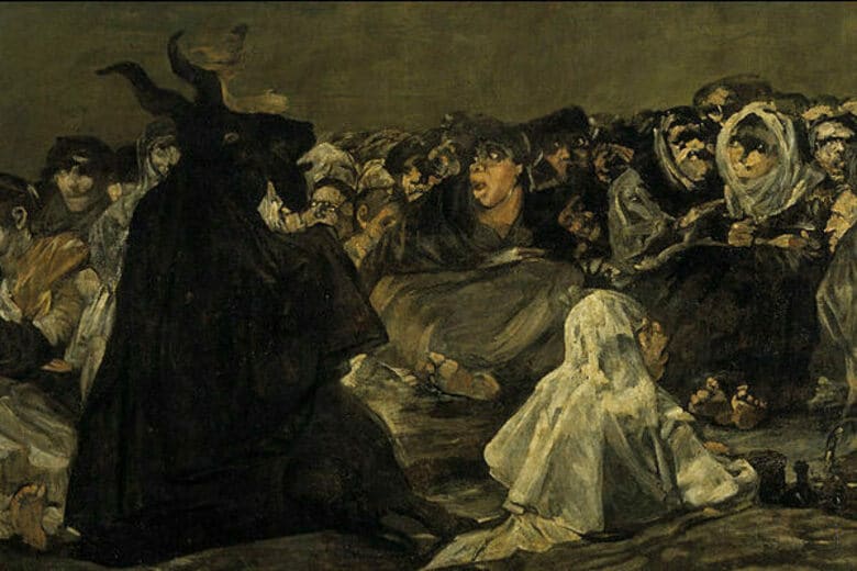
D – Dogfight (see main image). Marcel Sarmiento supplies my favourite film of the entire ABCs with this emotional curveball of a short that takes the relationship between a man and his best friend in a gut-punching new direction. If anyone in the entire ABCs deserves a Best Actor award, it’s Riley the dog; which is why I was delighted to discover that the “making of” bonus feature shows – with reassuring openness – the tricks, effects and awe-inspiring levels of dog-training that went into creating this beautifully savage film without harming either human or animal stars. A genuine masterpiece.

E – Exterminate. I’m not a fan of spiders and Angela Bettis does nothing to change my mind with this disappointingly simplistic riff on a particular horror trope that thankfully is mostly restricted to the realms of urban legend. No extras.

F – Fart. There are two kinds of people in the world – those who find fart jokes funny and those who don’t. From what I can tell, most of the population of Japan consists of the former, and certainly Noburu Iguchi is one of them. Despite its resoundingly absurd premise this light-hearted little romance-with-a-twist had me laughing for the duration, and the attached making-of reveals that it did pretty much the same for the cast and crew. I defy even the most po-faced critic not to chuckle somewhere along the line here.

G – Gravity. A snapshot of tragedy in paradise from Andrew Traucki, utterly stripped of context but still leaving a coldness in the gut. No extras.

H – Hydro-Electric Diffusion. Thomas Malling’s surreal riff on a Nazisploitation flick could have equally well been filed under F – for either Furries or Fascists, which aren’t two things I usually expect to see together. Despite this, taken for what it is this tale of the good, the bad and Third Reich mad science is well worth a look and a smile. The extras here are a little too extensive and repetitive (the parallel screening of the finished and making-of versions of the film doesn’t add anything to the making-of itself) but the how-to of making really convincing anthropomorphic animal masks might be of interest to many viewers and practical use to a few…

I – Ingrown. I was halfway to writing off Jorge Michael Grau’s painful little lock-in sequence of a woman’s victimisation and death as mere torture porn until I saw, in the final credits, the words “2015 women murdered in the last 10 years in Mexico… the horror is not on the screen”. And when Grau explains in the making-of how this message was deliberately framed to dovetail with the film itself, I realised that the compilers of the ABCs did this stark little piece a huge disservice when they moved all the credits to the end en masse. Respect to Grau for sacrificing his chance to make a merely artistic statement, in favour of this obviously far more personally significant one.

J – Jidai-geki (“Samurai movie”). About all I could glean from this is that Yudai Yamaguchi is a fan of funny faces, and the behind-the-scenes footage mostly reveals that it’s surprisingly hard to pull the right funny faces at the right moment and then film them effectively. Comical but disposable.

K – Klutz. I was almost expecting the K to be for Khazi, since once again we’re in the realms of bathroom humour with this animated short from Anders Morgenthaler. Gross as it gets, but with little beyond that to its name. No extras.

L – Libido. I’m somewhat glad that Timo Tjahjanto didn’t contribute anything else to go with this ultra-extreme piece of psychosexual horror, since I was wincing enough sitting through the piece itself. An endurance test for both the characters and the audience, this film will leave you either unable to masturbate for a week, or possibly, for some people, needing to do so the second the credits roll. While I was definitely in the former camp I’m still impressed with the sheer horrific imagination on show here. No extras.

M – Miscarriage. I think Ti West was stuck for inspiration, as he’s fallen back on a cheap combination of hot-button subject matter, and a quick gross-out punchline. There’s a nasty whiff of misogyny, too, in the choice of “baby mama” as the designation of the main and only character in the credits. No extras.

N – Nuptials. There’s an old joke about a man who bought a parrot that used to live in a brothel. I can only assume that joke is told in Thailand too, as Banjong Pisathanakun turns a variant on the idea into a short that goes from cuteness to catastrophe in one swift slide. Predictable but neatly executed. No extras.

O – Orgasm. I adored Bruno Forzani and Hélène Cattet’s magnificent Amer but was disappointed in this, not least because in its plotless, eventless sensory overload it could easily be a cutting-room outtake from another project that needed a sex scene shortening. I do love those two but this time, I think they’re faking. No extras.

P – Pressure. Originally titled “Paramaribo” for the capital of Suriname where it was filmed, this visceral, sympathetic portrayal of how far someone might go for what they love held my attention with its rich visuals and powerful, dialogue-free soundtrack. The extras here are interviews with director Simon Rumley, a shy man who seems much less at ease in front of a camera than behind one, and cinematographer Milton Kam – both interesting viewing, if low-key. I was touched by the compassion and lack of prejudice shown by both men, despite their dealing with several different kinds of social marginalisation and stigma here both onscreen and off – two thumbs up.

Q – Quack. Someone had to make a meta-film about the challenges of making a film based on an awkward letter, and Adam Wingard rises to the challenge with the help of a duck. Sadly, I suspect it’s because he genuinely didn’t have any better ideas. No extras.

R – Removed. Running Dogfight a very close second for my personal favourite here, Srdjan Spasojevic’s contribution mixes visceral body horror with an evocatively cryptic plot that must surely be only a snapshot of an entire story waiting to be told. If there’s one film here that I’d like to see expanded to a feature, this is the one. The only bonus here is a photo gallery featuring a handful of on-set snaps, neatly reflecting the odd sense of frustration-born-of-admiration that the film itself creates. Show me more, dammit!

S – Speed. Jake West almost lost me at the opening of this faux-grindhouse tale of two women, one car and a monstrous pursuer thanks to some painfully wooden acting, but the combination of this film’s raw, hyper-chromatic beauty and the dark twist of its ending left me forced to admit I’d enjoyed it. No extras.

T – Toilet. Yet more animated bathroom humour, this time of an even blacker tint, from Lee Hardcastle; a man whose claymation filmmaking style is so stripped-down that when asked to provide a behind-the-scenes, he simply talks to the camera for three minutes and in that time manages to explain his entire process from storyboard to completion. While I’m not a huge fan of this particular piece, I’ve got to applaud his genuine talent.

U – Unearthed. The death of a monster from a slightly unusual perspective, courtesy of Ben Wheatley. I think this suffered from being a short, as I’d have cared a lot more about the events if I’d seen the rest of the prior plot. No extras.

V – Vagitus. Kaare Andrews attempts to squeeze an entire futuristic dystopia into a very small space with moderate success; though as with Removed, this is a scenario that could clearly have been expanded to much greater length, as the inclusion of a deleted scene makes further apparent. The lengthy behind the scenes segment has some interesting moments, mostly pertaining to the FX and props, but was rather spoiled for me by its self-congratulatory tone. As for the tedious “Animatics” segment that consists entirely of the storyboard being run on-screen with the dialogue of the film recited over the top, the less said the better.

W – WTF. Another take on the “we’ve got no ideas for this letter” gimmick, according to Jon Schnepp the “plot” here is about the contents of people’s subconscious minds becoming real. All I can say is that I’m glad my own subconscious isn’t that of an attention-deficient man-child, then, because I’d hate to deal with this on a daily basis. The behind-the-scenes footage only reaffirms this film’s general air of delight at its own idiocy, as does the blooper reel that consists entirely of Schnepp and a crony laughing too hard at their own dialogue to actually deliver it. Unfortunately, they’re probably the only ones who were.

X – XXL. Xavier Gens has created a masterpiece of nightmarish social commentary with this tragic, traumatic take on what our society’s obsession with skinny women is doing to the rest of us who can’t fit into those jeans. I watched this through my fingers out of pure empathic distress, and yet was glad every second that someone had had the courage to create this horrifying testament to the unreasonable expectations and the suffering that so many women deal with in silence every day. No extras.

Y – Youngbuck. A creepy, clingingly unpleasant little fable of abused innocence and deserved revenge that Jason Eisener has for some reason dressed up entirely in eighties trappings; from the look, to the feel, to the acid-neon colours, to the soundtrack. Obscure, macabre and strangely compelling. No extras.

Z – Zetsumetsu (Extinction). While Yoshihiro Nishimura’s deranged portrait of an alternate Japan where nuclear energy got way out of hand has a certain weird charm for its sheer joie de vivre, the behind the scenes footage demonstrates that when a film didn’t make any sense to start with, seeing how it was done won’t leave you much the wiser. Oversexed, politically incorrect and utterly chaotic, this is at least a truly fitting end to the rollercoaster ride that is the ABCs of Death.

There’s one final extra on the second disc that I have to mention, though: AXS TV’s “A look at the ABCs of Death”. A short teaser reel featuring snippets from the films and insights from some of the directors, it’s a watchable little piece that would certainly have made me want to see the ABCs if I hadn’t already – but the thing that most caught my eye about it was a single red screen featuring the pull quote “Bloody fun – Brutal as Hell”. See, I told you we’d reviewed this thing too many times…

DVD Review: The Sigil (2012)

By Tristan Bishop

If you’re in love with film, you tend to find something to enjoy in nearly every film you watch, whether it be a performance, or camera-work, or (in the case of horror fans), a nice bit of gore. Most films aren’t great, a lot aren’t very good, but there will usually be something to hook the film buff and keep us watching. Once in a while, however, a film comes along that is so misguided in concept and execution that it beggars belief and makes watching the thing a chore. Ladies and gentlemen, I present, The Sigil.

How about this for a set-up? We learn that a mysterious event wiped out 41 people in a house in LA. At the time the government released a statement claiming the disaster was caused by an undiscovered uranium source. Yes. A very very VERY localised uranium source. So localised, that even the house six feet away hasn’t been evacuated. Devan, whose brother died in the house, decides to go on a road trip to the house in order to come to terms with his death (because rooting around in a uranium-rich environment is generally the sane way to deal with grief). She brings along her friend Nate, who brings along his camera-toting friend, as they have decided the journey should be documented on film (yep, this is, at least partially, a found footage film). Nate and Logan, being massive arseholes, decide that the point of the journey is to ‘blow the lid’ on the government conspiracy, rather than to help Devan come to terms with her loss. They attempt to break into the house on arrival, but are stopped by the young neighbour, Miki (played by her namesake Miki Matteson), who takes them aside and reveals that not all of the people in the house that night are dead…

It feels a bit harsh to trash a first feature, but in this case it’s probably well-deserved – a low budget does not mean you can skimp on a script, or some good ideas, and it certainly does not mean you can wheel out the now-tired found footage sequences that have been plaguing the direct-to-DVD market for far too long and expect not to piss off your intended audience. The set-up is patently ridiculous – it’s such an obvious government cover-up that no-one would have believed it, and those involved certainly wouldn’t have just left the house unguarded for any passing conspiracy-theorist to go and have a look. The characters are the biggest bunch of dickheads I’ve had the misfortune to spend 70 minutes with (at least it’s short!) and this is really not helped by amateur performances all-round (excepting the generally OK Matteson – credit where credit is due!). The found footage format is mercifully only used for about 50% of the film, but even this is no real saving grace with a film which even at such a short length feels stretched to breaking point. When the climax does come, there is a twist that, if it had been handled with any amount of skill by the film-makers, could have been rather good, but here it is signposted for a good half of the film, and the climatic sequences themselves are choreographed so ham-fistedly that they elicit no more than a head-slap and groan from the viewer.

So please, first-time directors: if you value your audience and aren’t, as I suspect in this case, contemptuous of horror fans and you’re just latching onto a cheap genre as a way of getting your name out there, get a script, rehearse it until it works, dump the found footage (unless you’re willing to work on other technical aspects such as sound design – which the recent The Entity got right), or at the very least give us a bucket of the red stuff, because we won’t stand for this crap for much longer.

Horror in Art: The Great He-Goat By Francisco De Goya


By Keri O’Shea

Few artists can boast such a versatile career as Francisco De Goya, although the great changes in his style through the five decades in which he worked were often tragic in origin. It is hard to reconcile Goya’s early work as a portrait painter to the Spanish royal court with the harsh, distended figures in his last paintings, but the latter were refracted through years of ill-health, and Goya’s own increasing alienation from a Spain which he thought was become retrogressive, anti-liberal. The fame of the so-called ‘Black Paintings’, of which the painting above is one, is ironic considering that it’s unlikely Goya ever wanted them to be seen. He never named them, displayed them or discussed them: having withdrawn entirely from public life by the time in which he was working on them, Goya, towards the end of his life by this point, painted these pieces directly onto the walls of his villa. However, they were discovered after his death, their importance was recognised, and they now form part of one of the most scintillating displays in Madrid’s Prado Gallery – a series of striking vistas of fear, death, ageing and the sinister supernatural which forms a strong contrast to the rooms upon rooms of Annunciations, Crucifixions and Resurrections.

The modern Spain of the 1820s had, in Goya’s eyes, become a sham: the Peninsular Wars had spread conflict and death, and he saw the combined forces of the monarchy and clergy which had gained in power in the years after the wars as reactionary, opposed to the progress and reason which the Enlightenment had promised. In this decade, Goya’s paintings take on a deeply nightmarish aspect. The Black Paintings are in many ways Goya’s protest against his times, as well as an expression of his terror at his own decline. One of the most famous of these has come to be called ‘The Great He-Goat’.

Goya had used the image of the coven before he came to paint The Great He-Goat. In 1798, for example, he had painted a similar scene (in a painting which is simply known as Witches’ Sabbath) – but despite the similarities in set-up between these two, the execution is massively different. The earlier painting has an attractive, Romantic landscape with a feeling of distance and depth; there is an abundance of colour, from the night sky to the simple, but bright fabrics worn by the women. When he revisited the image of the coven in the 1820s, much had changed.

This is, first and foremost, a large painting (55 x 93 inches in size) and yet, for all that, it feels cramped, claustrophobic. In contrast to the earlier coven, The Great He-Goat shows a much bigger group of people – maybe twenty or thirty – all rapt with attention and focused completely on the silhouetted He-Goat, who sits, neatly robed in what looks like clerical garb on the ground before them. This is a repellent group, too: although there are one or two younger faces amongst the gathered (at least judging by a glimpsed hairstyle on the left-hand side of the picture) and at least one male face, most of those present are older or elderly women – and ugly faces predominate, with heavy or distorted features in abundance. Some faces are rendered more or less as skulls, and some faces seem barely human at all: observe the figure sitting at the He-Goat’s feet. What is also striking about this coven is that, although there are identifiable faces in their midst, this seems like an amorphous mass, rather than a meeting of true individuals. The common ugliness, the common colourlessness, the proximity of one person to another, the way in which all of the gathered are huddled on the floor to listen to proceedings gives an impression of a lack of individuation.

One or two figures stand out from this meeting, though. A crone at the far left of the scene seems to be writing notes on whatever is being said which has so fascinated the rest of the group; at the feet of the Goat there looks like more written notes and an ink-pen. A collision between modernity and superstition perhaps? Coven this may be, but with a scribe and a written record present, it looks as though bureaucracy doesn’t necessarily guarantee reason and order, which seems to be what Goya felt when he created this piece of art. Then, sitting apart from (and being completely ignored by) the others is the painting’s only visibly youthful and attractive character, a rather genteel and well-dressed young girl who appears to be a prospective initiate. Passively, with none of the vividity of the other figures, she faces the He-Goat, and waits. Her fate, should she be accepted, is to become one of the horde who seem more intrigued by the procedure of enrolment than by her as an individual.

The Great He-Goat is a painting of anger, hopelessness and despair, created by a man who saw the next generation in Spain being enslaved by the old irrationality which he had hoped was in decline. It is an ominous painting, reflecting the anxieties of the impending Ominous Decade. The coven here is a therefore used as a symbol of the fear of resurgent barbarism – of people’s propensity to throw in their lot with systems and beliefs which had seemed to be relics of the past. Horror cinema has continued to use the coven or the secret society, often in similar ways to Goya, riffing on the idea that modernity is in fact a very tenuous thing and, more so, that it could be jeopardised by covert groups working in its midst. Modern horror has added an important difference of its own, however: here, those who would inflict harm in private look respectable in public, such as in Rosemary’s Baby (1968) and The Lords of Salem (2013), to name but two. If we can unite Goya’s work with modern horror in one fundamental way, though, it is through understanding that history is not a straight line, moving from darkness upwards towards progress; it is a series of peaks and troughs, and the actions of even small groups of people can precipitate the sort of decline that we may, in our arrogance, assume is long behind or beneath us. In that, we may share Goya’s rage and frustration.

You can see a larger version of The Great He-Goat here.